
2021.08.06
EXHIBITION 06
Bienvenue Studios
Design from Natureand wander journal #30
自然からインスピレーションを受け取り、グラフィカルな印刷物などを制作するスイスのデザインデュオ「Bienvenue
Studios(ビエンベニュー・スタジオ)」。モチーフになっているのは、植物や石、昆虫などの自然物。独自の審美眼が、自然界にある「美」と「形状」をすくい上げ、色鮮やかなポストカードやアートブックを生み出します。そこに込められているのは、自然への敬意やモノづくりへの情熱。自然の美しさを日常へと届ける作品をどうぞお楽しみください。
2021年8月20日(金)〜9月26日(日)
12:00 – 19:00 (最終日は17:00までとなります)
東京都渋谷区元代々木町22-8 3F, 4F and wander OUTDOOR GALLERY with PAPERSKY
tel. 03-6407-8179
“Bienvenue Studios”, a design duo from Switzerland, draw on the inspiration they get from nature to create
graphic prints and other design products. They use natural objects and materials such as plants, stones and
insects, as motifs in their work. Their unique aesthetic perspective captures the “beauty” and “form” of the
natural world to create colourful postcards and art books. Their art work embodies a deep respect for nature and
a passion for the creative process. Welcome to the world of “Bienvenue Studios,” where designers Olivier
Hischier and Xiaoqun Wu turn nature into a visual culture that is certain to bring the beauty of nature into
your daily life.
Friday, 20 August ~ Sunday, 26 September 2021
12:00 - 19:00 (The exhibition will close at 17:00 on the last day)
and wander OUTDOOR GALLERY with PAPERSKY 3F, 4F
22-8 Motoyoyogicho, Shibuya, Tokyo
tel. 03-6407-8179
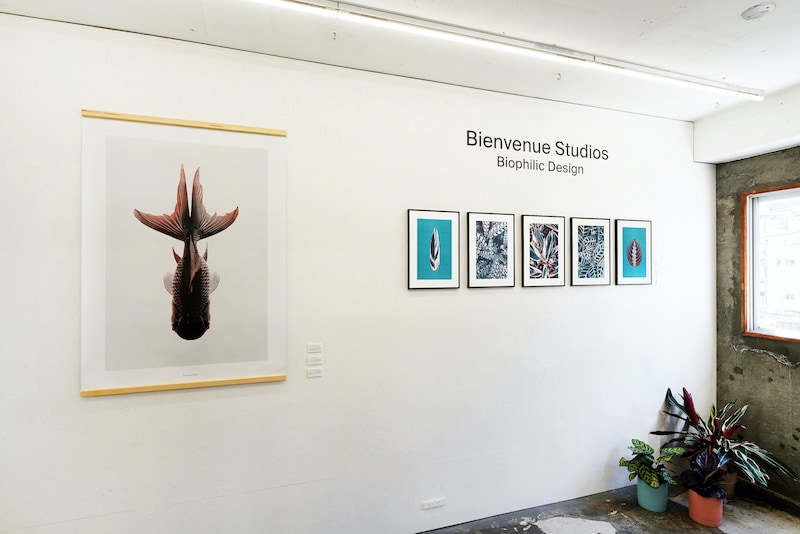
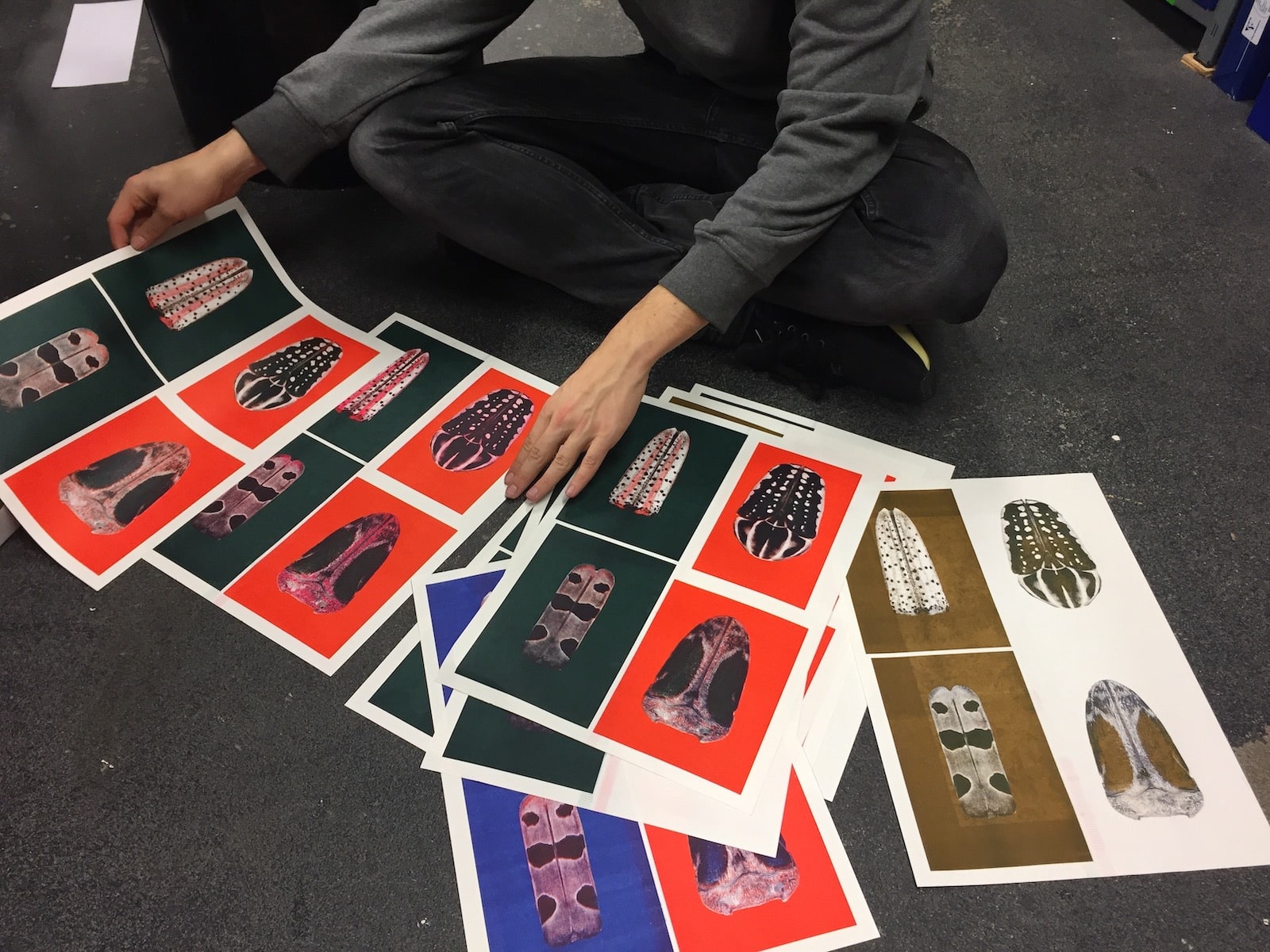
Extra large silkscreen print poster in the entrance hall.
Postcard sets and card stands will also be on sale.
Various A3 poster series will also be on display.
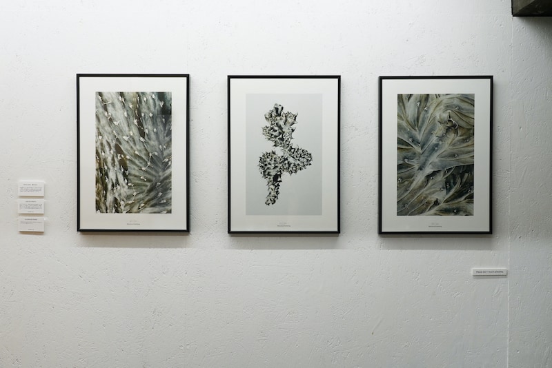
Posters from the “Quiet Water” series in black aluminum frames.
INTERVIEW
紙とインクで表現する自然の美と多様性。
リソグラフやオフセットで刷った、色鮮やかなポスターやカード。蝶の羽や鳥のくちばし、一枚の葉など、自然物の一部を抜き出したデザインはどんなコンセプトから生まれるのか? ビエンベニュー・スタジオのオリバー・ヒッチャーとシャオクン・ウーに話を聞いた。
Nature’s beauty and diversity expressed with paper and ink
We interviewed Oliver Hischier and Xiaoqun Wu from “Bienvenue Studios” to learn about the concepts behind their designs. Their colourful postcards and posters are printed using Risograph and offset, and depict singular elements of nature, such as a butterfly’s wing, a bird’s beak, or a single leaf.
――スタジオ名にある「ビエンベニュー」とは?
英語の「welcome」にあたるフランス語です。私たちは、オープンマインドでフレンドリーなこの言葉を気に入っています。自然からインスピレーションを得て生まれた私たちのデザインに、世界中の人をお迎えしたい、そんな思いで名づけました。
――Tell us about the name of your studio ‘Bienvenue’.
“Bienvenue” means “welcome” in French. We would like to welcome everyone to our nature-inspired designs. We also love this word because it is open-minded and friendly.
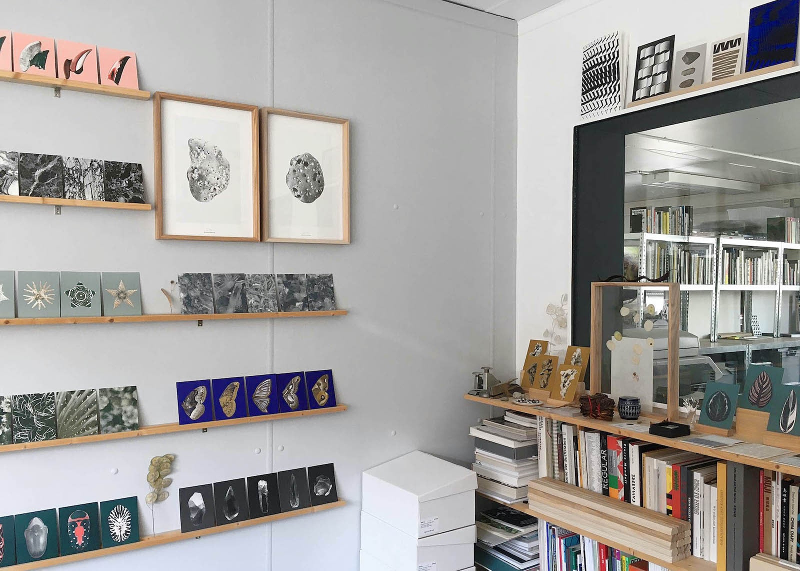
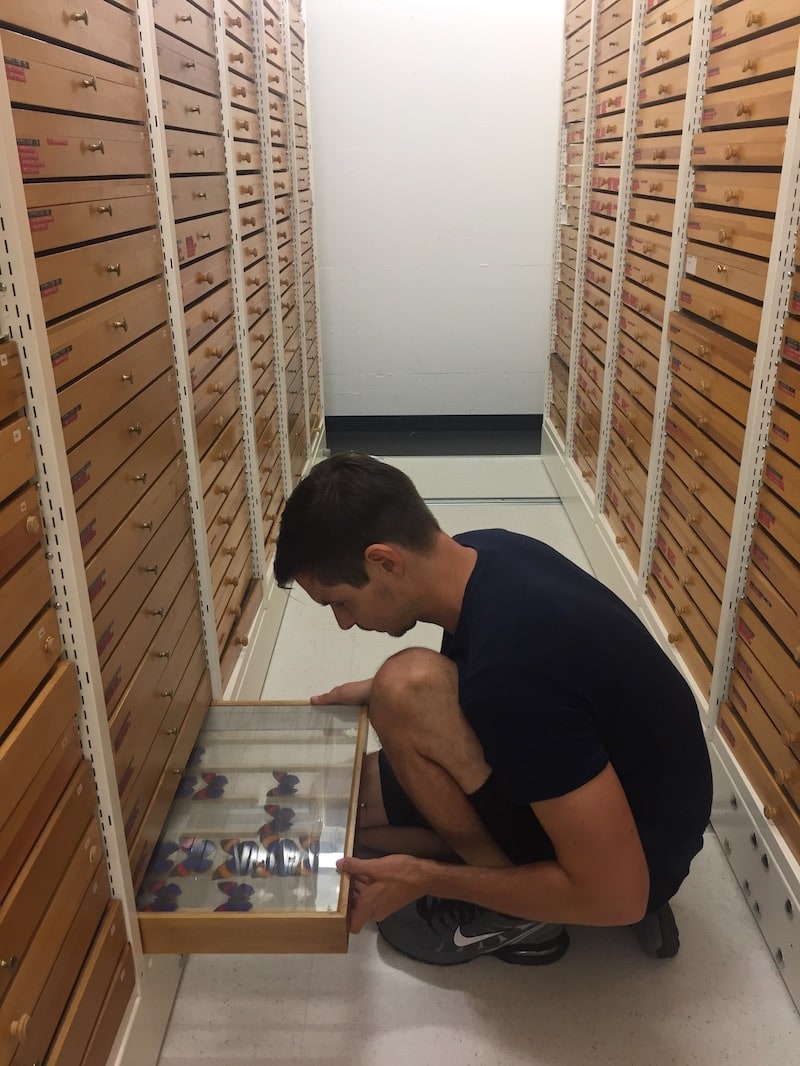
スイス・チューリッヒにあるスタジオの様子。ポスターを飾るフレームやポストカードを立てた木製のディスプレーもすべて彼らが制作したもの。
Their studio located in Zurich,
Switzerland. The poster frames and wooden postcard stands are also all made by the duo.
――オリバーさんはスイス生まれ、ウーさんは上海生まれだそうですね。
はい、オリバーが育ったのは南スイスのブリークという自然豊かな田舎町です。一方、ウーの故郷は、世界最大の都市のひとつである上海。12歳でスイスに移住したウーは、その時初めて、自然の美しさを目の当たりにしました。私たちはチューリッヒにあるF + Fスクールフォーアートアンドデザインで出会い、それ以来、一緒に活動しています。ウーとの出会いを通してオリバーは、誰もが平等に自然にアクセスできるわけではないことを知りました。忙しい人、都会に暮らす人にとって、自然は遠い存在なのだ、と。この発見が、わたしたちの活動のきっかけになっているんです。
――植物などの自然物をモチーフにしているのにはそんな理由があったのですね。ところで、それぞれのモチーフはどうやって見つけるのですか?
私たちがモチーフを見つける方法はたくさんあります。旅行中に偶然発見したり、博物館に行った際に気になる標本を見つけたり。本をパラパラと捲っている時にふと目に止まったものがモチーフになることもあります。新しいシリーズに加える時の基準は2つです。ひとつはユニークな形をしていること。パッと見ただけでは認識しづらいシルエットだったり、拡大してみることで印象が変わる形だったりすると興味をそそられます。もうひとつは、そのモチーフの背景に物語があること。2つがセットになって初めて、新しい題材として取り上げようと決めるのです。
――Oliver, you were born in Switzerland, and Wu you in Shanghai, is that right?
Yes, Oliver grew up in Brig in the middle of the Swiss Alps. Wu, on the other hand, comes from Shanghai, one of the world’s largest metropolises. While Oliver was surrounded by nature in his childhood, Wu grew up between high-rise buildings and tight spaces. When Wu moved to Switzerland at the age of 12, she started discovering the beauty of natural landscapes for the first time. Our paths finally crossed at the F+F School for Art and Design in Zurich. Since then, we have been working together and in 2019 we completed our Masters in Design at the University of the Arts in Bern. Through exchanges with Wu, Oliver learned that nature is not equally accessible to everyone – due to geographical location or the demands of a hectic everyday life that hardly allows for any breaks. This recognition became our guiding principle: to bring the beauty of nature into people’s lives, to inspire and to raise awareness of it.
――So that’s one of the reasons behind using natural objects such as plants as your motifs. Could you tell us about how you select your motifs?
There are a lot of ways that we find our motifs: It can happen when we are traveling, visiting a museum, or simply looking at a book. In order for something to become a new “Bienvenue Studios” series, we are looking for two criteria: it has to be formally interesting, a shape that you don't immediately recognize, or something that we can enlarge and look at more closely. In addition, there must be an interesting story to it, something from nature that we want to pass on and tell people about, to sensitize people and inspire them. And we work in series because we want to showcase the beauty of biodiversity.
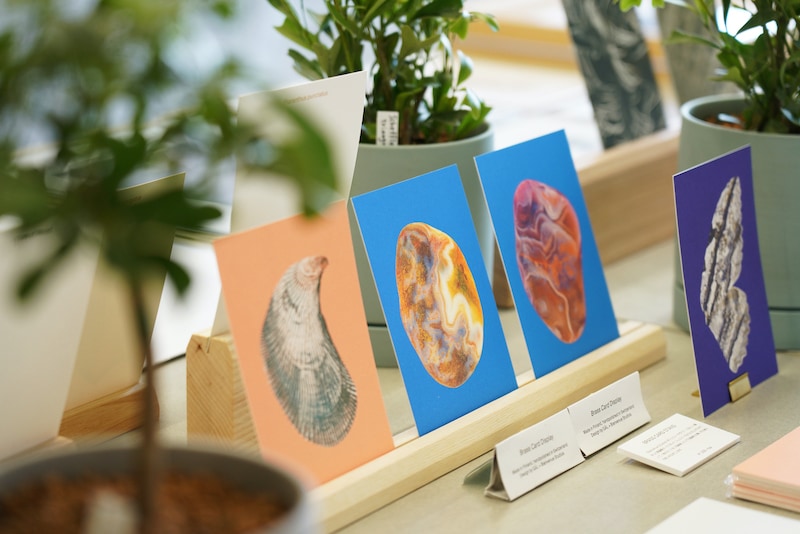
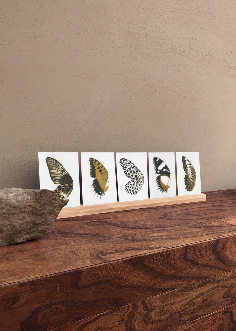
〈Praying Hands〉シリーズ ポストカード5枚セット¥1,925(税込)
Set of 5 postcards
from the “Praying Hands” series. ¥1,925 (incl. tax)
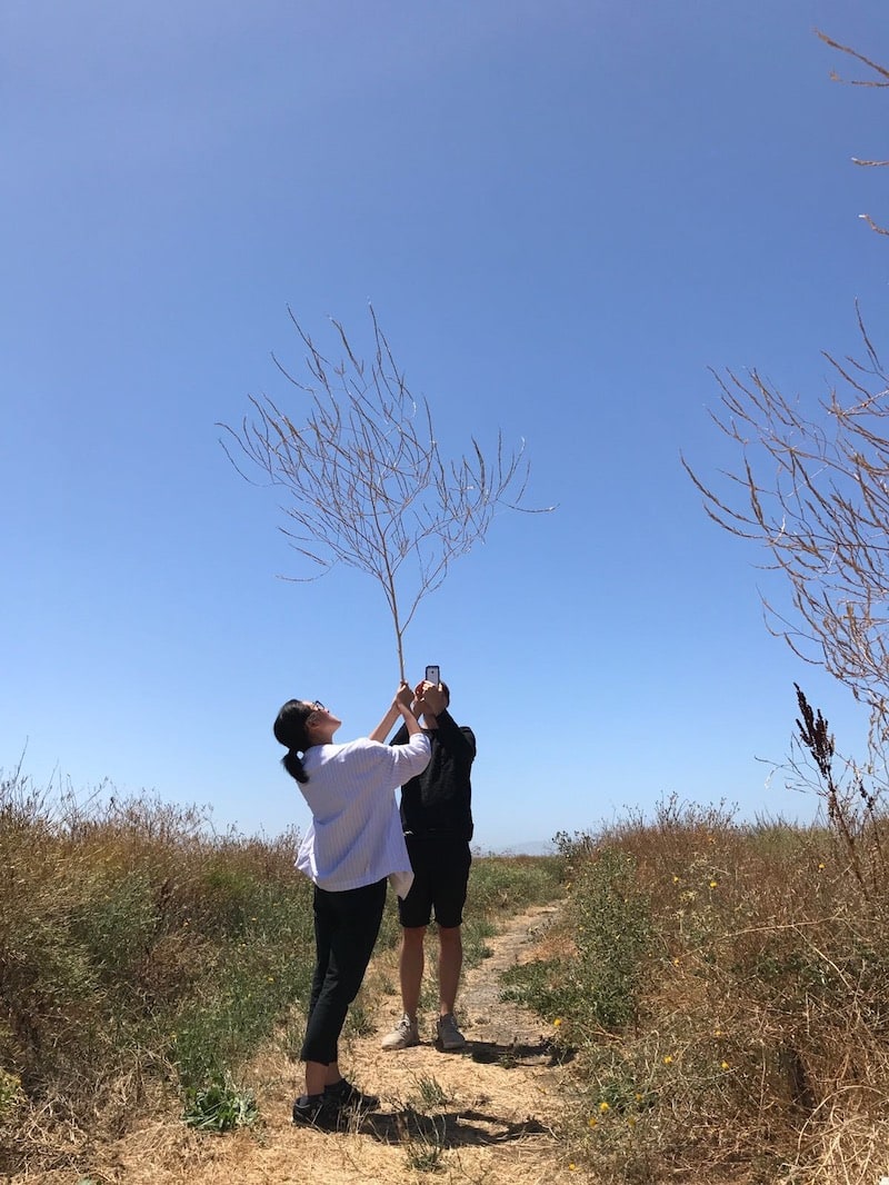
旅先の草原で。足を運んだ博物館で。さまざまな場所でモチーフを探す二人。自然からのインスピレーションはあちこちにあると気づかせてくれる。
In a meadow on their travels or in a
museum they visit - the duo search for new motifs in a manifold of places, demonstrating how nature’s
inspiration can be found all around us.
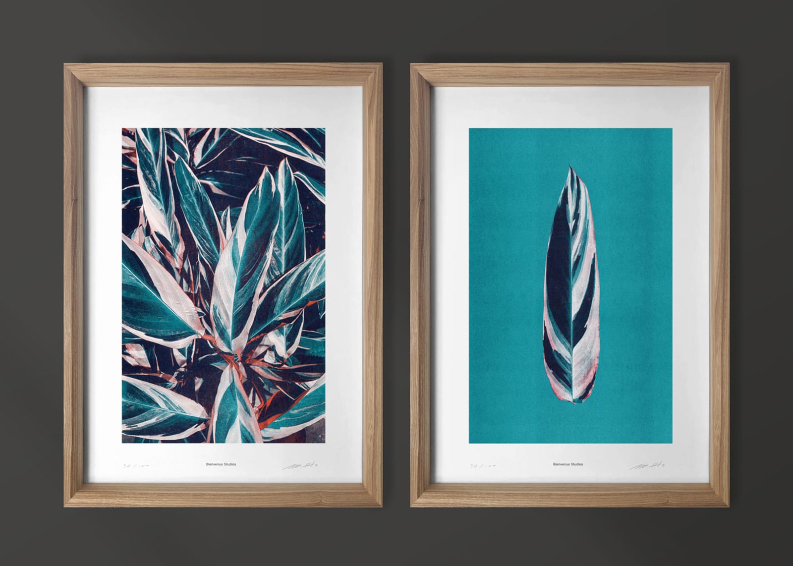
――例えば、葉っぱをモチーフにした〈Praying Hands〉シリーズには、どのようなエピソードがあるのですか?
これはブラジルの熱帯雨林に自生するマランタという植物の葉です。この植物の通称は「プレイヤープランツ」。つまり「祈りの植物」です。理由は、夜になるとこの植物が、葉を直立させて、折りたたむから。2枚が重なり合った姿が、ちょうど祈りを捧げる人の手の形のようで、こう名づけられたそうです。
――だから、シリーズ名に「Hands」という言葉が含まれているのですね。
そうなんです。「Plants」を「Hands」 に置き換えて、シリーズ名にしてみました。プレイヤープランツは50種近くあるとされ、葉の模様も一枚一枚違ってとても美しい。私たちはその美しさを、集合体と個体の2つのバージョンで表現することにしました。私たちの作るプロダクトは、どのシリーズも5つのビジュアルが1つのセットになっています。連続したビジュアルによって生物の多様性を伝えたいと考えているんです。
――Could you tell us the story behind your “Praying Hands” series, which uses leaves as a motif.
The series focuses on a leaf from the Maranta plant that grows in the Brazilian rainforest. This plant is known as the “Prayer Plant” because its leaves rise and fold in together at night, resembling a person’s hands that have been put together in a prayer pose.
――So that’s why the name of the series has the word “Hands” in it.
Yes. We switched the word “plant” with “hands” to create the series’ name. There are said to be nearly fifty different species of prayer plant, and the pattern on each leaf is unique and beautiful. We decided to try and express this beauty in two different formats, as a collection and as an individual object. For all our products, our series are made up of five visuals, that come together to create one set. We want to present the diversity of living things by having the visuals in a series.
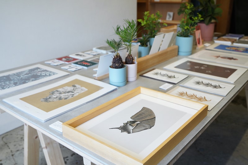
〈Praying
Hands〉シリーズ A3ポスター ポスター各¥9,350(税込) 木製フレーム各¥16,500(税込)
A3 posters from the “Praying Hands” series. Posters
¥9,350 each (incl. tax), wooden frames ¥16,500 each (incl. tax)
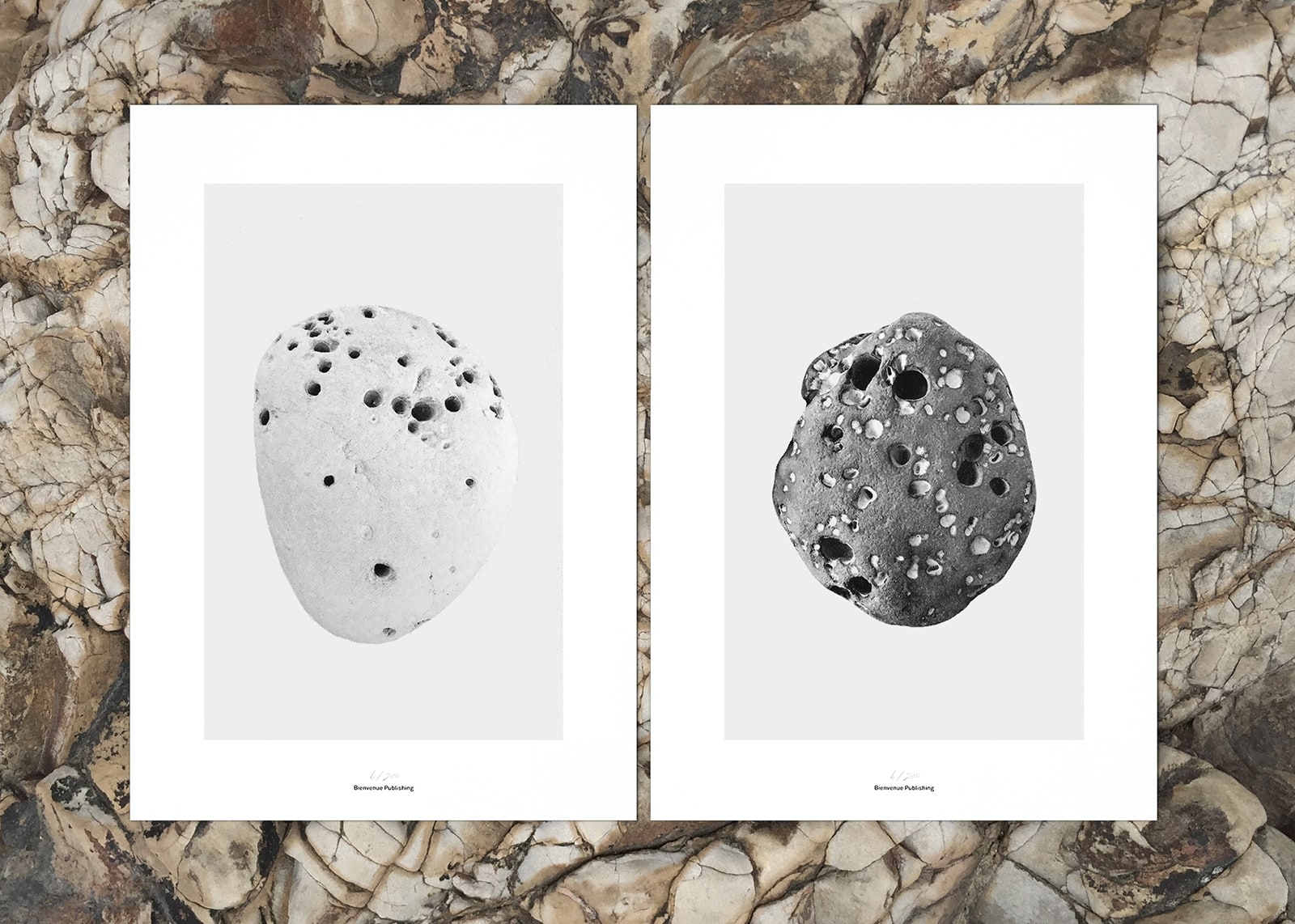
〈Riverstones〉シリーズ A3ポスター ポスター各¥9,350(税込)
A3 posters from the
“Riverstones” series. Posters ¥9,350 each (incl. tax)
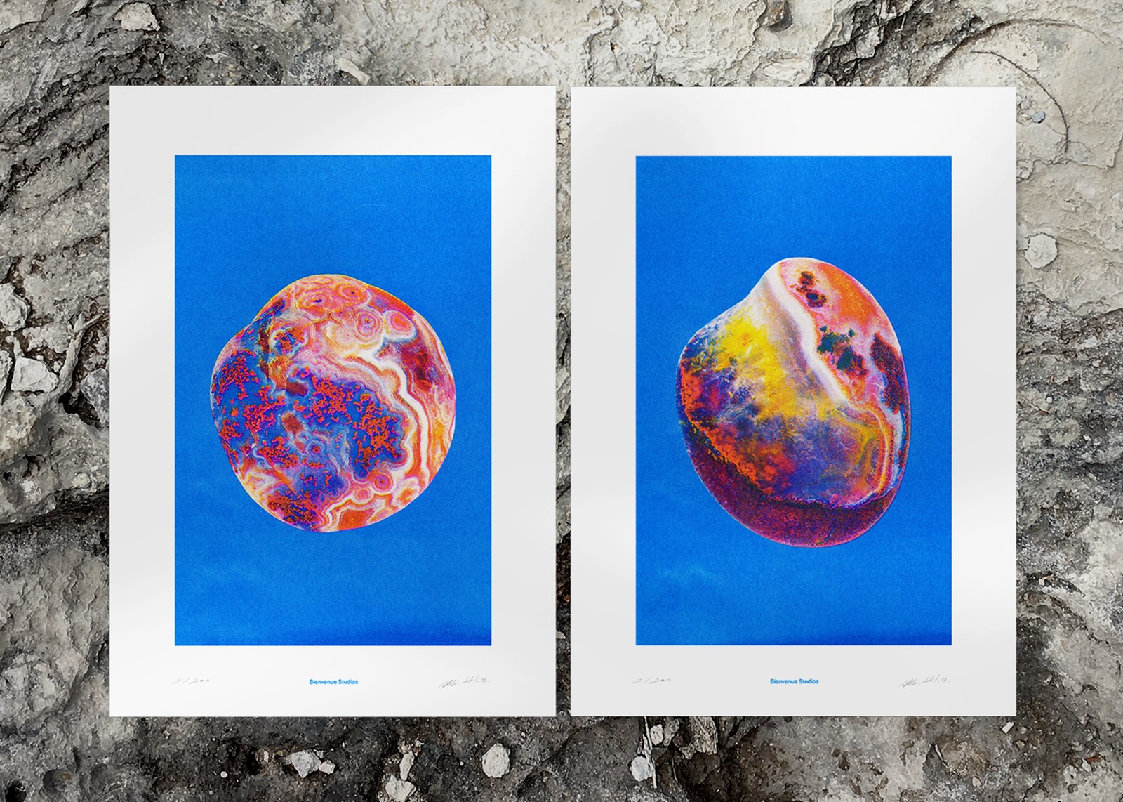
――なるほど。では、青い背景に石をプリントした〈Riverstones〉シリーズにもユニークなエピソードがありますか?
これは上海の隣、南京市の揚子江で採取される雨花石です。模様が美しく、世界中にコレクターがいる貴重な石なのですが、私たちが惹かれているのはデザインだけではありません。この石にはユニークな伝説があるのです。あるところに誠実な僧侶がいたそうです。神は彼の忠誠心に感心し、それを讃えるために色とりどりの花を天から振りまいたそうです。その花が地面に着いた瞬間、輝く石に変わった。それが、雨花石だと言われているのです。川の水の流れによって研磨された石は滑らかな質感となり、美しいマーブル模様を一層引き立てます。私たちのプリントでは、背景をスカイブルーとし、色のコントラストを楽しめるようにしました。
――物語を知ると、モチーフの印象も変わって面白いです。
そう言ってもらえると嬉しいです。私たちの興味は形や色、そしてエピソードです。こうした背景を知ってもらいたいので、ポストカードの裏側にもストーリーを印刷しています。
――見つけたモチーフをプロダクトに落とし込むまでにはどんな作業があるのですか?
私たちはすべてを写真として記録します。それによって、自然界から何かを持ち去ることをせずにものづくりができます。
また、写真はモチーフを多様な角度から見ることにも適している手法です。葉も、石も、蝶も、たとえ同じ名前が付いていたとしても、ひとつとして同じ模様やフォルムはありません。可能な限りたくさんの個体を写真に記録するようにしています。その後、それぞれのモチーフをどの角度から見た姿でビジュアル化するかを決めます。蝶は羽だけに、鳥はクチバシだけになることもあります。
――I see. Is there also a unique story behind the “Riverstones” series of stones printed onto blue backgrounds?
These are Yuhua stones found in the Yangtze river in Nanjing city, which is next to Shanghai. They are rare stones that are collected all around the world for their beautiful colours and patterns, but we were attracted to them not only for their appearance. We were also interested in a particular legend about their origin. The legend has it that there was once an honest monk and God was so moved by this monk’s sincerity that he made thousands of colourful flowers rain down from the sky his praise. The moment these flowers touched the ground, they turned into shining stones and it is said that those stones were the Yuhua stones. The river water polishes them making them smooth and bringing out their beautiful marble patterns. In our prints we use a sky-blue background so that the viewer can enjoy the contrast.
――Knowing the story changes the impression you get from the motif, that’s so interesting.
It makes us happy to hear you say that. We are interested in form, colour, and narratives and we actually print these stories on the backs of the postcards, because we want people to know about the narratives behind our motifs.
――What work is involved in creating a product out of a motif?
We document everything photographically. We take images from different angles and look for as diverse a motif as
possible. By using photography, we are able to leave the objects in nature.
Photography as a method is
also suited to capturing a subject from multiple angles. Although certain leaves,
stones, butterflies may go by the same name, no two items ever have the same form or patterns. We try to
photograph as many objects as possible. After that we decide from which angle we want to visualize each motif.
In some cases, we make look only at the wing of a butterfly, or just the beak of a bird.
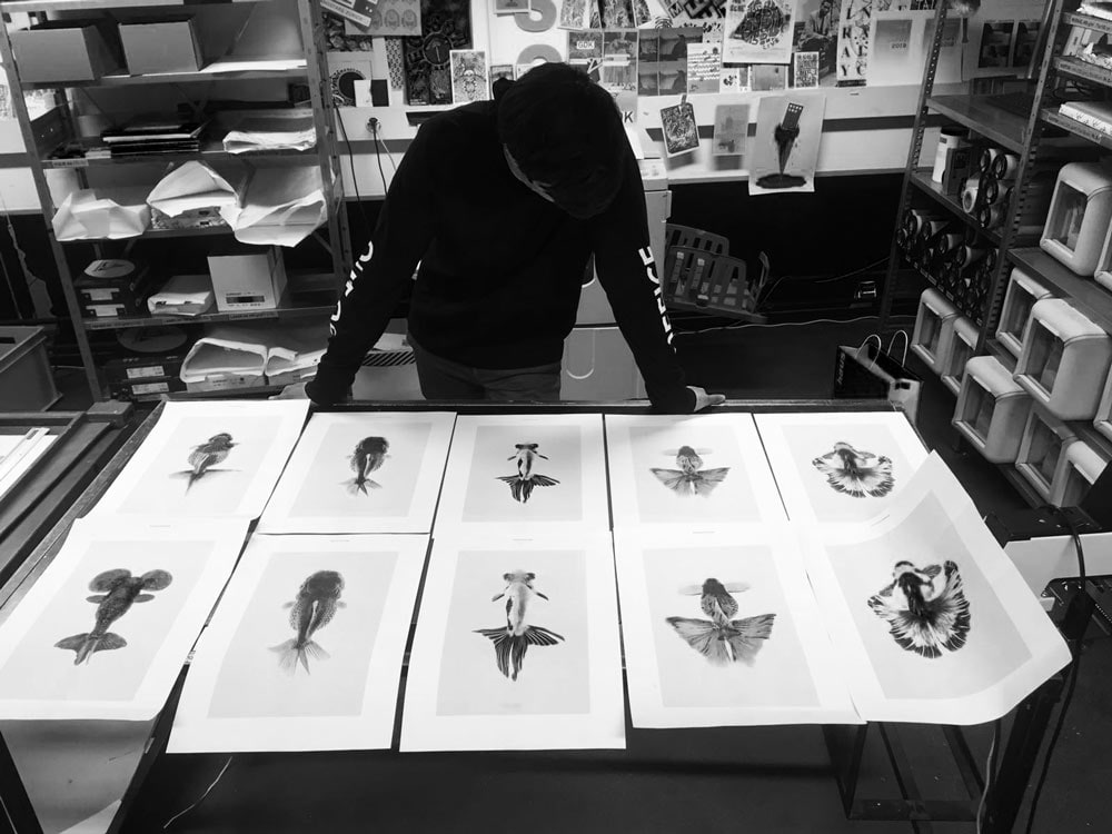
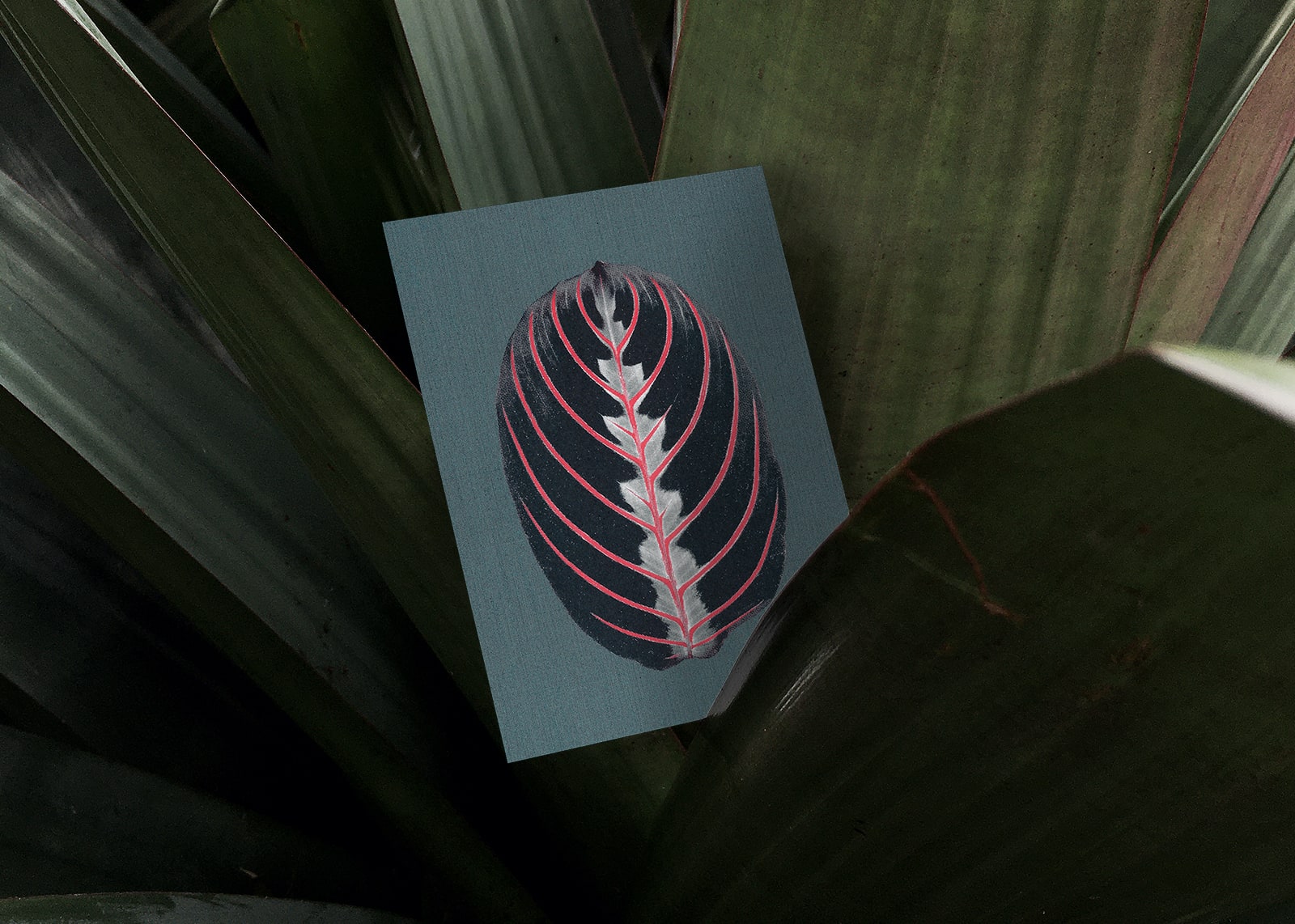
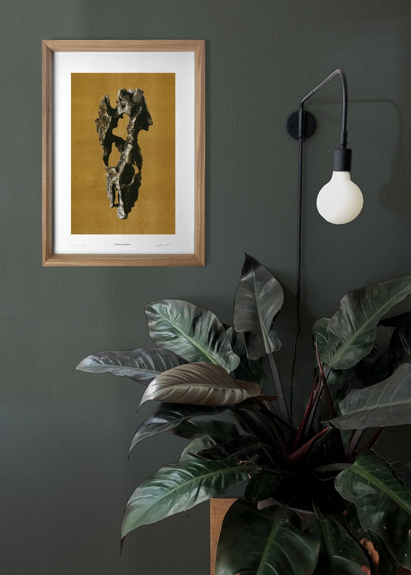
ウーの故郷である中国の文化を感じさせる、金魚をモチーフとした〈Morbid
Being〉シリーズのリソグラフ。真俯瞰のアングルが、尾びれの形状の模様の個性を引き立てる。
Your Risograph prints from the series “Morbid Being” use
goldfish as a motif and are reminiscent of the culture of Wu’s homeland, China. The bird’s-eye perspective
enhances the singularity of the pattern and form of the tail fin.
――デザインが決まったら、今度は印刷ですね。
はい、モチーフをどんな色で印刷するかも重要です。リソグラフで実際に刷ってみながらテストを繰り返します。パソコン上ならワンクリックで色が変えられますが、それでは私たちが求める色にたどり着かないのです。テストプリントを何度も繰り返しながら、そのモチーフにぴたりとくる色を探るのですが、それは決して、自然界の色をそのまま表現することではありません。時にはより鮮やかにしたり、反対にモノトーンにしたりすることで、私たちが感じるモチーフの魅力を最大限に引き出したいと思っています。
――Once the design has been decided, then you move on to the printing, is that right?
Yes, the colour we use to print the motif is also important. We experiment on the Risograph, making numerous test prints in different colours and sections until we have found the right tonality for the series that expresses exactly what we feel it should. However, this doesn’t mean trying to recreate the colours as they are in the natural world. Sometimes we might make it brighter, or contrastingly, we might make it more monotone, to enhance the beauty of the motif as we perceive it, to the maximum.
リソグラフの試し刷りをチェックするオリバー。リソグラフとは、日本生まれのデジタル印刷機で、版画のような仕上がりが世界中のクリエイターに支持されている。
Oliver checks the Risograph
test print. Risograph printing is a duplication-printing technique and digital printer that was developed in
Japan. It is used by creators around the world for its traditional printmaking finish.
〈Pacific Marks〉シリーズ A3ポスター ポスター各¥9,350(税込)
A3 posters from the
“Pacific Marks” series. Posters ¥9,350 each (incl. tax)
――緻密なステップですね。ひとつひとつの手順が積み重なって、プロダクトに奥行きを作っているのだと分かってきました。仕上がったカードやポスターを飾るためのフレームもオリジナルですね。これもとても素敵です。
ありがとうございます。5つのビジュアルを並列して眺められるようにと自分たちでデザインして作りました。こうして並べて見比べることで、自然の生み出す差異や多様性を感じてもらえたら嬉しいです。“Curiosity
Cabinet(驚異の部屋)”と名付けた木製のフレームは、壁にかけてもいいですし、棚などの平面に置いても使えます。博物館のディスプレイからヒントを得たもので、上部に開けた差込口からスライドしてポスターを設置します。
手軽に入れ替えができるので、季節ごとにビジュアルを変えてもいいと思います。木は、スイス産のトリネコ材。ひとつひとつ手作業で作っていて、スイスにある障がい者労働団体と協力して製作しています。
――That’s a very elaborate process. I’m starting to understand how each process builds on the previous one to add depth to the finished product. You also make your own original frames to display your cards and posters. These are also very beautiful.
Thank you. We designed and made them ourselves so that people would be able to line up all five visuals and look
at them together. We hope that people will be able to sense the distinction and diversity created by nature. We
designed the picture frame “Curiosity Cabinet” as a way to bring a piece of nature into our own four walls. We
were inspired by the historical display cases in zoological museums. Like the showcases, the frames reveal a
fascinating world.
It’s easy to change what’s in the frame, so you can also change the visuals according
to the season. We use
Swiss Ash for the wood. Each one is individually handmade and we work with a vocational organization for people
with disabilities in Switzerland for their manufacturing.
ポストカード5枚セット¥1,950(税込) ポストカードスタンド¥4,070(税込) フレーム〈Curiosity
Cabinet〉¥16,500(税込)
Set of 5 postcards ¥1,950 (incl. tax), postcard stand ¥4,070 (incl. tax), frame
(Curiosity Cabinet) ¥16,500 (incl. tax)
――自分たちのプロダクトを作る以外の仕事についても聞かせてください。今期は〈and wander〉ともコラボレーションが実現し、新作が生まれました。振り返ってみていかがでしたか?
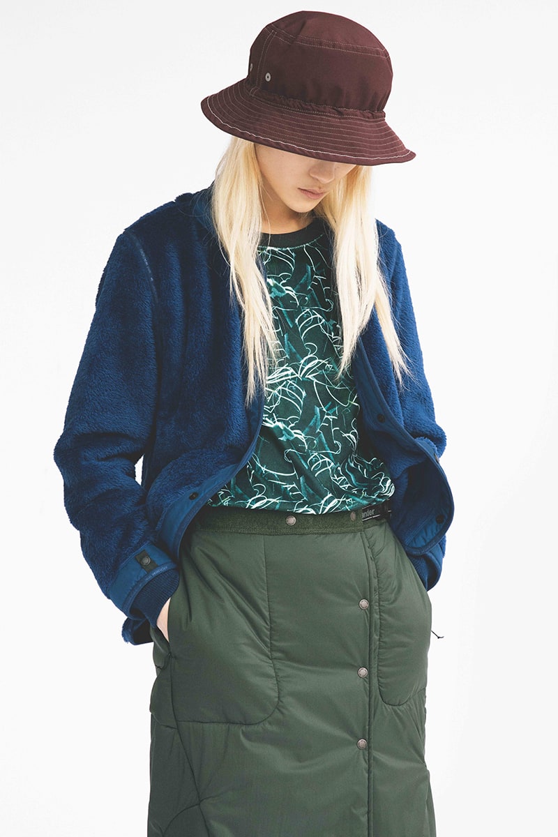
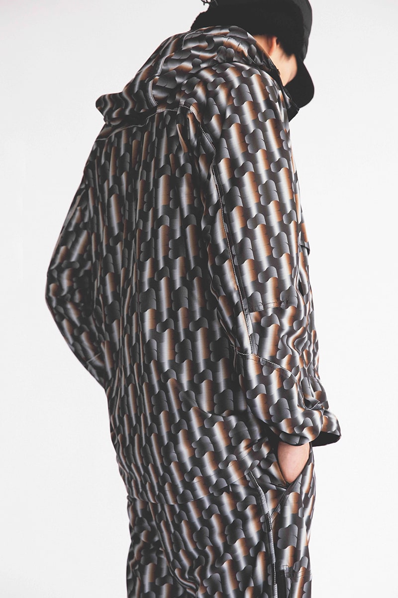
とても楽しいコラボレーションでした。〈and wander〉の新作のために生み出したのは3つのアートワークです。ひとつは乾燥地帯に生息する植物をパターン化したもの。今回の展覧会のメインビジュアルにもなっています。その植物は、水のない環境を生き抜くために保水能力に長けています。強い生命力に惹かれ、今回のモチーフに選びました。もうひとつは木の幹を拡大し、パターン化したもの。このモチーフはスイス南部のヴァレー地方で見つけたものです。そして最後のひとつは、丸い粒状のパターンですが、ベースとなっているのは氷の粒です。氷の結晶をクローズアップした時の美しさを図案化しました。スイスは自然豊かな国ですが、アウトドアのファッションブランドとアートがコラボレーションすることは稀です。その意味でも今回の仕事は私たちの大きな喜びとなりました。
――Could you tell us a bit about other work that you do on top of creating your own products? This season you collaborated with “and wander” and some new works were born out of this. Looking back, how has the collaboration been for you?
It was a big pleasure for us to work with “and wander”. We created three pieces of art for the new project with “and wander”. The first was a pattern based on plants that grow in arid regions. This is also the main visual for the exhibition. The plant is very good at retaining water in order to be able to survive in an environment where water is scarce. We chose it as the motif for the exhibition for its vitality. The second work is a pattern created from the enlarged image of a trunk of a tree. We found this motif in the Valais region in southern Switzerland. The final work is a pattern made up of round granules, and is based on grains of ice. We created the design to embody the beauty of a magnified image of an ice crystal. Although Switzerland has a lot of nature, the idea of combining art and fashion and outdoor clothing is still quite unusual in the Swiss market. So this collaboration was exciting because we have adapted our designs to wallpaper or covers so far but never in clothes!
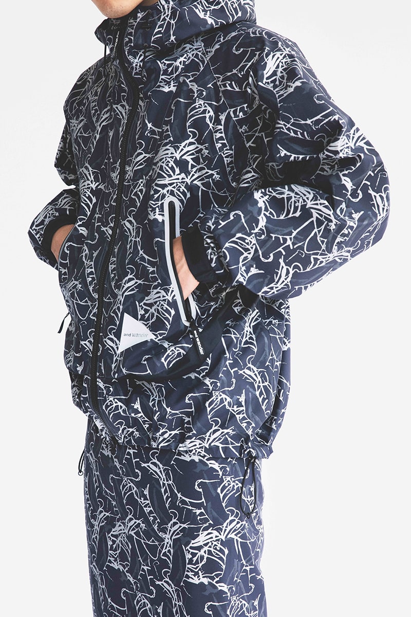
ジャケット(ブルー)reflective
printed rain jacket ¥93,500(税込)
Tシャツ printed
fleece base T ¥28,600(税込)
ジャケット(ブラウン)printed
raschel rip jacket ¥52,800(税込)
Reflective
printed rain jacket (blue) ¥93,500 (incl. tax)
printed fleece base T ¥28,600
(incl. tax)
printed raschel rip jacket
(brown) ¥52,800 (incl. tax)
――最後に、あなたたちがコンセプトに掲げる「バイオフィリック・デザイン」について教えてください。
“自然は私たち人間に幸福をもたらす”。これが、私たちの掲げる「バイオフィリック・デザイン」の軸となる考えです。オリバーはスイス、ウーは上海で、それぞれに多様な経験をしてきました。ヨーロッパとアジアという異なる地域で育った私たちですが、どちらの地域も今、人間社会と自然の美しい調和が失われつつあります。特に、上海のような都会で暮らす人々は、自然の中で過ごす時間が持てなくなってきているのです。
そんな日々の中に、少しでも自然の豊かさを取り入れたい、と私たちはプロダクトを作りはじめました。人は、自然と接することを生物として求めているはずです。自然物をじっくりと観察し、そこからパワーを受けることは、私たちをより生き生きと輝かせてくれます。心が落ち着き、気分がよくなり、仕事の生産性も向上するかもしれません。
一枚のポスターを部屋に飾ることで、そんな作用をもたらすことができたら。自然の力によって豊かな暮らしを育んでほしい、それが私たちの願いです。
――Finally, please tell us about your concept of “Biophilic Design”.
An environment with natural elements has a positive effect on the health and well-being of people. The concept
of “Biophilic Design” is dedicated to this. Through our different experiences in Asia and Europe we have
realized that the relationship between the artificial world we live in and nature is disturbed. Nowadays, not
everyone has the opportunity to spend time in nature on a regular basis.
However, everyone has an innate, biologically-determined human need for contact with nature. To discover,
perceive, and observe nature from close up is an experience from which we can draw all our strength. Surrounded
by nature, we are healthier, feel better, and are even more productive.
This well-being, aesthetic stimulation and calmness is what we want to make available to people through nature
in their everyday lives. Through “Biophilic Design” we bring the beauty of nature into the rooms in which we
live and work.
PROFILE
Bienvenue Studios
(ビエンベニュー・スタジオ)
スイス・チューリヒを拠点に活動するグラフィックデザイナー、オリバー・ヒッチャーとシャオクン・ウーによるデザインデュオ。2016年より活動を開始。自然現象の探求と視覚変換をテーマに印刷物やデジタルメディアで作品を発表する。西洋と東洋、異なる文化の視点から、自然とデザインの接点を探る活動を続けている。
Design duo from Zurich, Switzerland, Oliver Hischier and Xiaoqun Wu. Beginning their collaboration in 2016 the duo creates print and digital media works focused on the pursuit of natural phenomenon and visual transformation. Always searching for the point of connection between nature and design and exploring these aspects from the different points of view of Western and Asian cultures.
http://bienvenuestudios.com
edit PAPERSKY
text Yuka Uchida
photography Bienvenue Studios, Machiko Fukuda(exhibition photo)